install.packages("tidyverse")Lesson 6: Data Visualization I
Introduction
One of the most exciting capabilities of R is its ability to make high-quality, publication-ready, reproducible graphics. While tables and numbers are often the result of data analysis, data visualization is an essential component of both exploratory data analysis and data communication. Only looking at tables and summary statistics can make it easy to miss important things about your data, such as outliers and other surprising data structures. And presenting a carefully constructed chart to a stakeholder is often more engaging than a wall of numbers.
Microsoft Excel is one of the most popular tools for making data visualizations, and you can do a lot of great work in it! But, as with other data work you do in Excel, a drawback is that it can be hard to reproduce or re-create a chart. Creating charts using a programming language like R may take a little more work up front, but often you can save time in the long run. Additionally, creating charts with the same tool that you are using to analyze data reduces the risk of copy and paste errors that may occur when exporting data to Excel to create charts.
ggplot2
R has built-in tools to make data visualizations, but ggplot2 is the most widely used package to create static plots in R. The three key components required for creating a plot using ggplot2 are: data, aesthetic mappings, and layers. These are each explained in the following sections.
ggplot2 is named for the grammar of graphics, a framework for describing the components and structure of a graph.
Data
The input data for a ggplot2 plot is a tabular dataset with rows and columns (more precisely, a data frame). Generally, this is a dataset that you’ve read in from a CSV or Excel file that you manipulated in some way using R.
More to come on data frames in the next lesson!
Aesthetic mappings
This is a fancy phrase for telling ggplot2 which variable from your dataset to put on the x-axis and which variable to put on the y-axis. You can also use aesthetic mappings to set the fill, color, size, and other aesthetic elements of a plot.
Layers
You can create nearly any kind of plot using ggplot2, and setting the layer defines what kind of plot you want to make. These are things such as bar charts, line charts, scatterplots, and many more.
Your first ggplot
To get started with ggplot2, you’ll need to make sure you have the package installed. If you have installed the tidyverse set of packages, ggplot2 is already installed because it is part of the tidyverse. If you haven’t installed the tidyverse, execute this in the console:
The examples you’ll work through use the National Prisoner Statistics releases file that you learned about in the previous lesson about importing data, so make sure you have access to the Excel file named nps-releases.xlsx. First, attach the tidyverse and readxl packages. Then, create a new dataset called nps_release by reading in the Excel file.
The following code assumes you have nps-releases.xlsx in the data folder of your project.
library(tidyverse)
library(readxl)

nps_release <- read_excel("data/nps-releases.xlsx")
Print the dataset to see some basic information. It contains 4,590 rows and 8 columns. Each row contains releases of different types by state, year, and sex.
nps_release# A tibble: 4,590 × 8
year state_name state_abbr sex rel_total rel_uncond rel_cond rel_oth
<dbl> <chr> <chr> <chr> <dbl> <dbl> <dbl> <dbl>
1 1978 Alabama AL m 2823 1070 1485 252
2 1978 Alabama AL f 161 46 92 20
3 1979 Alabama AL m 2790 723 1777 272
4 1979 Alabama AL f 215 33 174 8
5 1980 Alabama AL m 3264 524 2173 552
6 1980 Alabama AL f 188 24 147 16
7 1981 Alabama AL m 2973 520 1695 746
8 1981 Alabama AL f 221 20 137 63
9 1982 Alabama AL m 2919 1097 1451 349
10 1982 Alabama AL f 172 44 118 10
# ℹ 4,580 more rowsBar chart
For your first ggplot, you’ll make a bar chart of releases by year for Ohio. You need three components to make this chart.
- Data: Use the
nps_releasesdataset and include only rows where thestate_abbris"OH". - Aesthetic mappings: Use the
yearcolumn for the x-axis and therel_totalcolumn for the y-axis. - Layers: Create a bar chart by specifying the
geom_col()layer to be added to the plot.
Don’t worry about the syntax details in the following examples; future lessons will explain in more detail.
nps_release |>
  filter(state_abbr == "OH") |>
  ggplot(aes(x = year, y = rel_total)) +
  geom_col()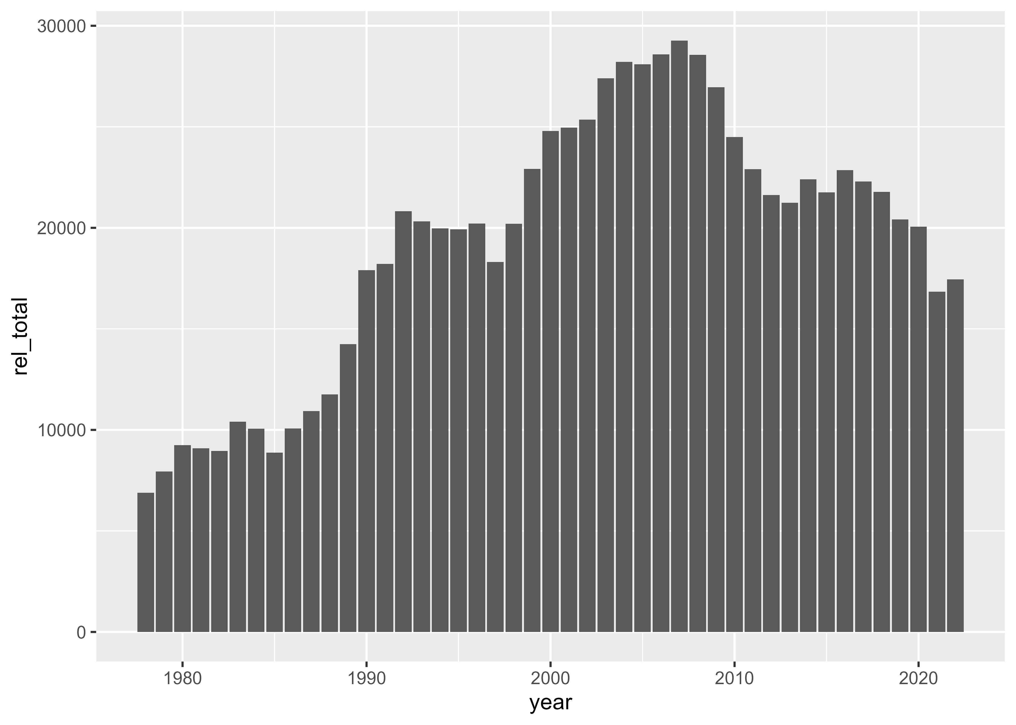
Now you have a chart!
One great thing about making plots using code is that you can easily make the same plot but with a different variable on the y-axis. For instance, you can switch the aesthetic mapping for the y-axis from rel_total to rel_uncond to plot the number of unconditional releases per year.
nps_release |>
  filter(state_abbr == "OH") |>
  ggplot(aes(x = year, y = rel_uncond)) +
  geom_col()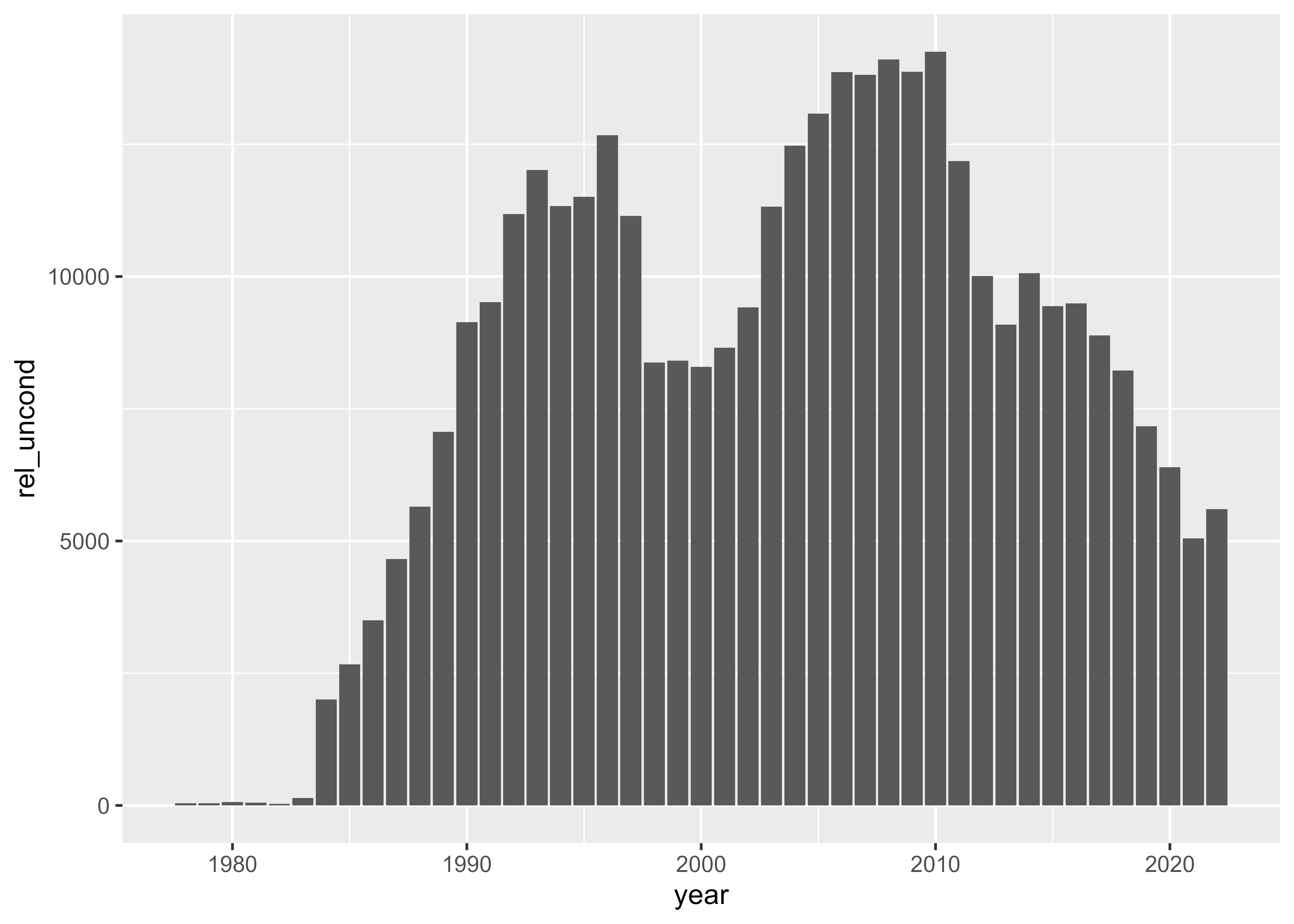
With this one small change to the code, you can drill down into a specific aspect of the data or compare this subset to the total—or simply adjust the analysis for your stakeholders.
Stacked bar chart
If you remember the structure of the dataset above, you have one row for male releases and one for female releases. In the first two plots, you added those rows together to plot the total number of releases. But, you can also show female and male releases separately using a stacked bar chart.
To create this chart we need an additional aesthetic mapping: map the sex column to the fill aesthetic. Start with the exact same code as our first plot but add fill = sex.
nps_release |>
  filter(state_abbr == "OH") |>
  ggplot(aes(x = year, y = rel_total, fill = sex)) +
  geom_col()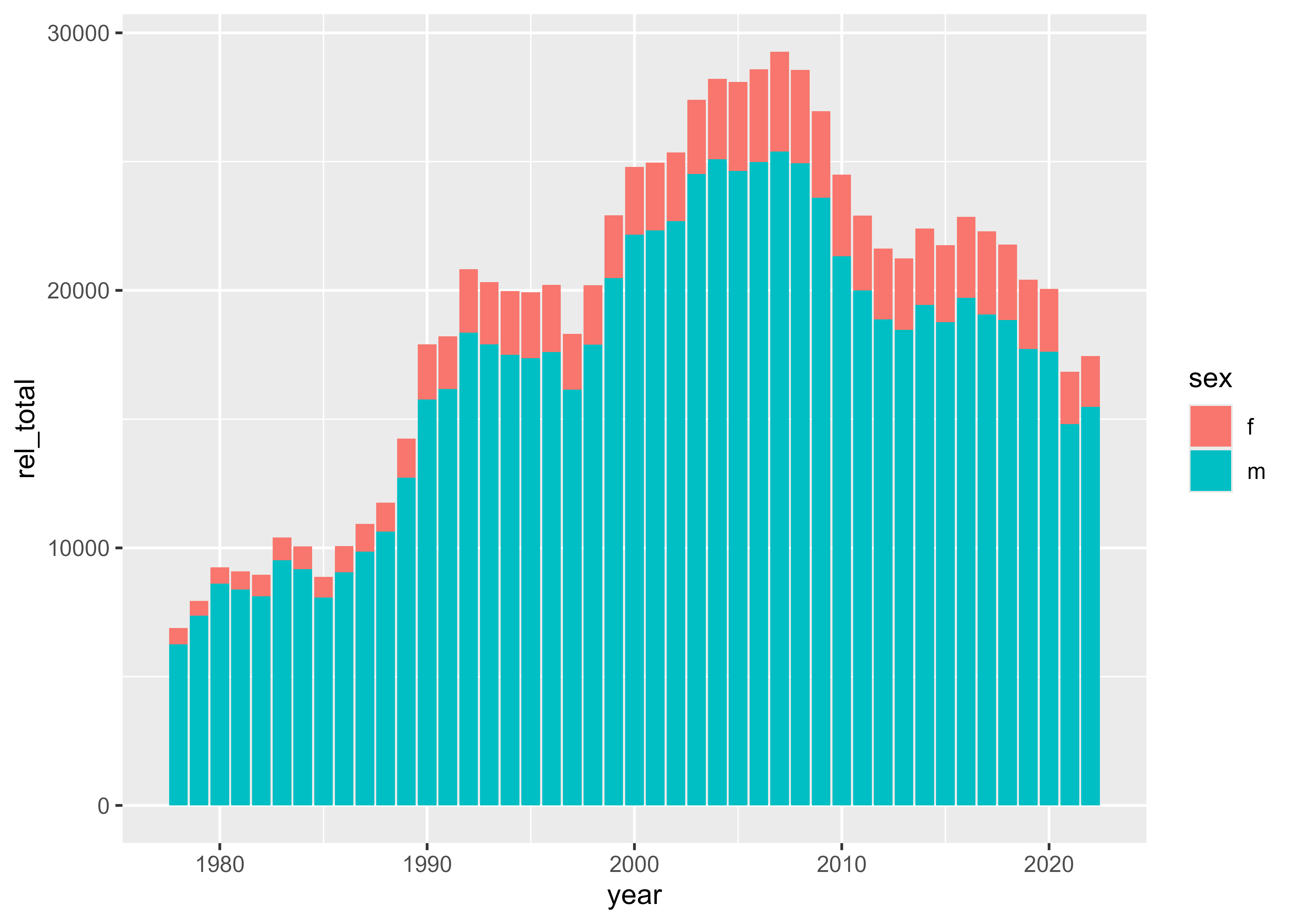
Now you have two segments of each bar representing releases of women and men, plus a legend that shows what each fill color represents.
Line chart
You can change the type of plot by changing the layer or geom. Instead of using geom_col() to make a bar chart, use geom_line() to make a line chart. You’ll also need to change the sex aesthetic mapping from fill to color since you want to set the color of the line, not the fill of the bar.
nps_release |>
  filter(state_abbr == "OH") |>
  ggplot(aes(x = year, y = rel_total, color = sex)) +
  geom_line()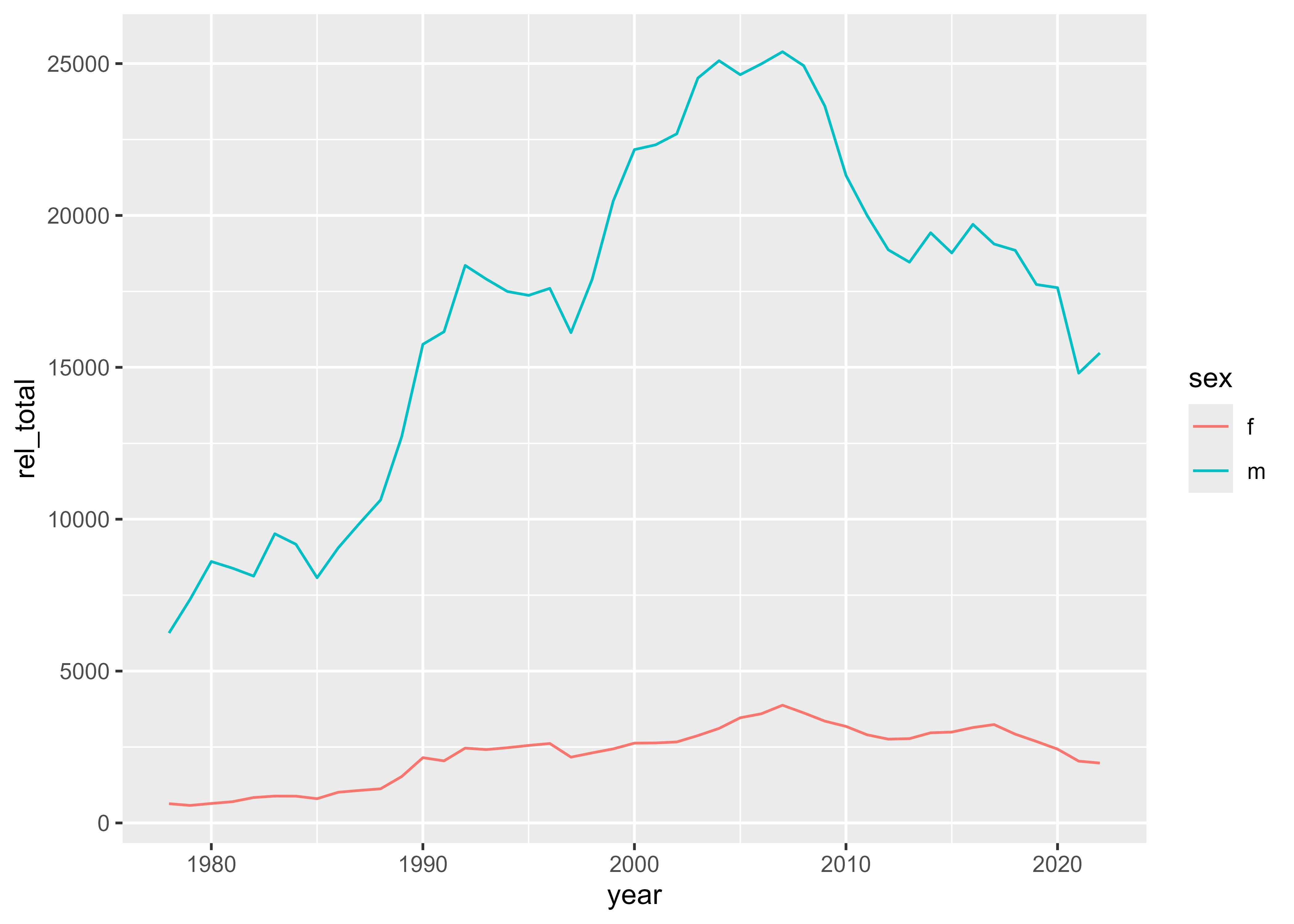
A different state
So far, you’ve only modified the ggplot2 code to change the plot, but you can also modify the data that is used by ggplot2 to get a different plot. All of the examples above used Ohio data. But if you want to make the same plot for another state, you can copy and paste the code and change the state_abbr that you use to filter. Here, for example, you can look at releases by sex for Massachusetts.
nps_release |>
  filter(state_abbr == "MA") |>
  ggplot(aes(x = year, y = rel_total, color = sex)) +
  geom_line()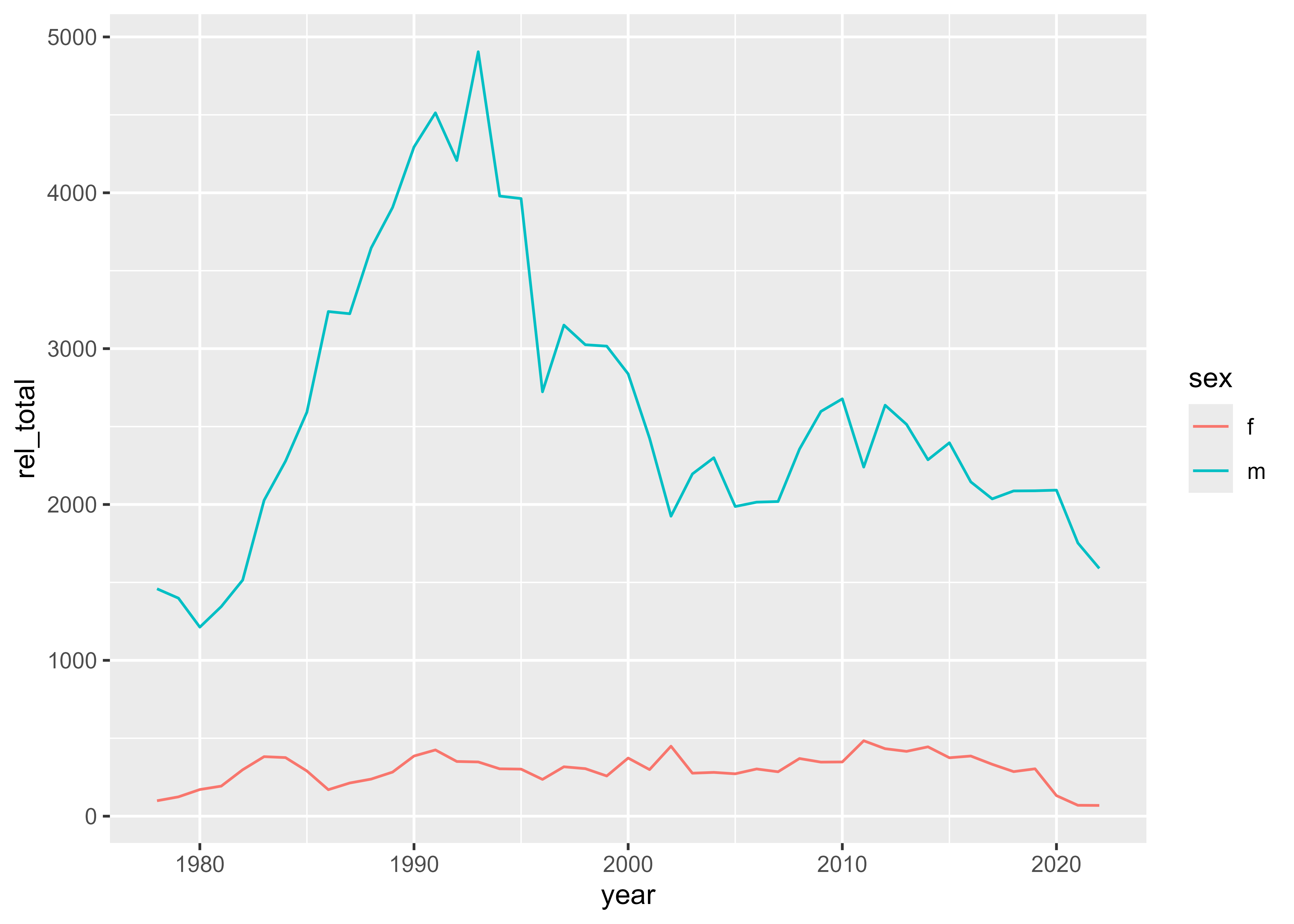
This is just the tip of the ggplot2 iceberg, but it’s still very useful! In future lessons, you’ll work on improving these plots by modifying the labels, colors, and theme, as well as introducing additional plot types. The complexity and creativity you can incorporate into ggplot2 is limitless. The R Graph Gallery is a fun website to browse for inspiration.