library(tidyverse)
library(readxl)

nps_release <- read_excel("data/nps-releases.xlsx")Lesson 11: Data Visualization II
Introduction
In Lesson 6, you learned about ggplot2—the key static plotting package for R—and the essential elements of a ggplot were discussed: data, aesthetic mappings, and layers. In this lesson, you will learn to add scales, labels, and themes to enhance and customize the basic plots you made. In addition, you’ll modify the input data used to make the plots more interpretable. You’ll also learn how to export plots you make in R to an image file. Plots made with ggplot2 are endlessly customizable and after this lesson, you’ll be able to get your plots ready for prime time (or at least your quarterly reports).
The examples you’ll work on in this lesson use the same nps_release data frame that you’ve worked with in previous lessons. Read in nps-releases.xlsx, with the following code:
In Lesson 6, the plots you made were bar charts or line charts that had years on the x-axis and the number of releases on the y-axis. This worked well for looking at trends in a single state. But what if you want to compare the number of releases across many states for a single year? To do this, use filter() in combination with the operators you learned about in Lesson 8 to create a subset of the dataset to plot and then adjust the aesthetic mappings to fit the new data.
The subset of the dataset will be for 2022 and include only the states in New England. To create this subset, start with the original nps_release data frame and use filter() to only include rows where the year is 2022 (year == 2022) and the state is Connecticut, Maine, Massachusetts, New Hampshire, Rhode Island, or Vermont (state_abbr %in% c("CT", "ME", "MA", "NH", "RI", "VT")). Recall from Lesson 8 that you use the == operator to keep rows that are equal to a value; you use the %in% operator to keep rows that are part of a group of values; and you use the & operator to combine these two conditions and specify that both must be true. Assign this new data frame to an object called nps_release_new_eng_2022.
nps_release_new_eng_2022 <- nps_release |>
  filter(year == 2022 & state_abbr %in% c("CT", "MA", "ME", "NH", "RI", "VT"))

nps_release_new_eng_2022
# A tibble: 12 × 8
year state_name state_abbr sex rel_total rel_uncond rel_cond rel_oth
<dbl> <chr> <chr> <chr> <dbl> <dbl> <dbl> <dbl>
1 2022 Connecticut CT m 2651 1134 1438 79
2 2022 Connecticut CT f 188 64 114 10
3 2022 Maine ME m 769 286 463 20
4 2022 Maine ME f 101 32 66 3
5 2022 Massachusetts MA m 1590 750 790 50
6 2022 Massachusetts MA f 69 25 37 7
7 2022 New Hampshire NH m 823 116 687 20
8 2022 New Hampshire NH f 98 10 87 1
9 2022 Rhode Island RI m 405 270 123 12
10 2022 Rhode Island RI f 24 12 10 2
11 2022 Vermont VT m 807 0 0 0
12 2022 Vermont VT f 65 0 0 0When you print nps_release_new_eng_2022, there are only 12 rows, 1 for male and female releases in each of the 6 New England states.
Now, make a stacked bar plot showing the number of releases in each state by sex. For this plot, map rel_total to the x-axis, state_abbr to the y-axis, and sex to fill.
nps_release_new_eng_2022 |>
  ggplot(aes(x = rel_total, y = state_abbr, fill = sex)) +
  geom_col()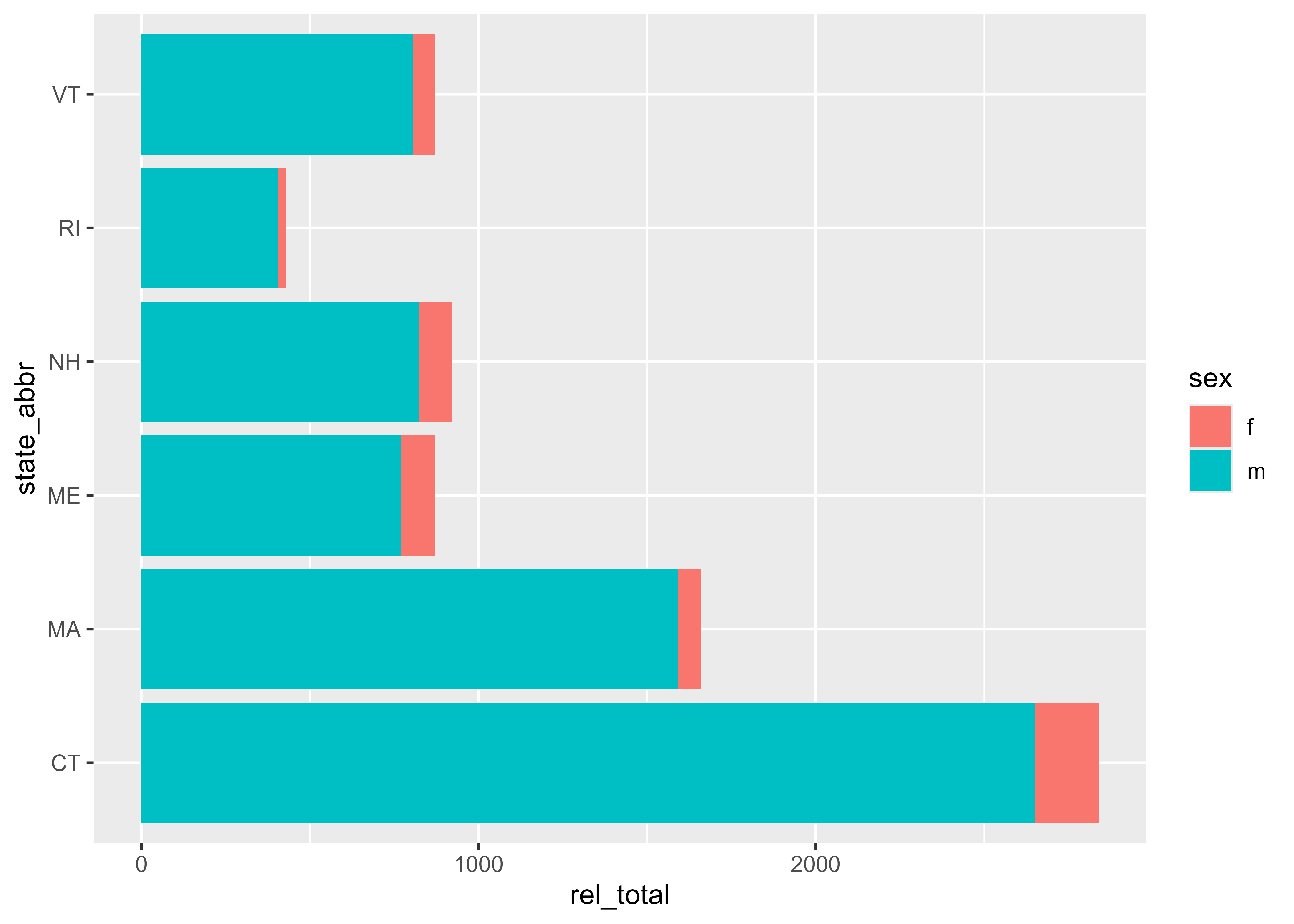
This is a horizontal bar chart showing the number of releases in 2022 by state and sex for the selected New England states.
Sort order
One way to improve this bar chart is to sort the bars into a meaningful order. By default, ggplot2 displays bars alphabetically from bottom to top. To check the sort order of a plot, use the arrange() function from Lesson 8 to sort by the column that will be plotted.
nps_release_new_eng_2022 |>
  arrange(state_abbr)
# A tibble: 12 × 8
year state_name state_abbr sex rel_total rel_uncond rel_cond rel_oth
<dbl> <chr> <chr> <chr> <dbl> <dbl> <dbl> <dbl>
1 2022 Connecticut CT m 2651 1134 1438 79
2 2022 Connecticut CT f 188 64 114 10
3 2022 Massachusetts MA m 1590 750 790 50
4 2022 Massachusetts MA f 69 25 37 7
5 2022 Maine ME m 769 286 463 20
6 2022 Maine ME f 101 32 66 3
7 2022 New Hampshire NH m 823 116 687 20
8 2022 New Hampshire NH f 98 10 87 1
9 2022 Rhode Island RI m 405 270 123 12
10 2022 Rhode Island RI f 24 12 10 2
11 2022 Vermont VT m 807 0 0 0
12 2022 Vermont VT f 65 0 0 0It would be easier to compare states if the bars were sorted from smallest to largest by number of releases rather than alphabetically. To accomplish this, create a custom sort order of the state_abbr column based on the values of the rel_total column. The function fct_reorder() does this exact task. The first argument of fct_reorder() is the column to be sorted (state_abbr), and the second argument is the column containing values used to sort by (rel_total). After executing this function, use arrange() to sort by state_abbr again and you’ll now see Rhode Island at the top and Connecticut at the bottom because Rhode Island had the fewest total releases and Connecticut had the most.
Using fct_reorder() converts state_abbr into a factor variable. There is lots to learn about factors, but for now, you can use them to create custom sort orders.
nps_release_new_eng_2022 |>
  mutate(state_abbr = fct_reorder(state_abbr, rel_total)) |>
  arrange(state_abbr)
# A tibble: 12 × 8
year state_name state_abbr sex rel_total rel_uncond rel_cond rel_oth
<dbl> <chr> <fct> <chr> <dbl> <dbl> <dbl> <dbl>
1 2022 Rhode Island RI m 405 270 123 12
2 2022 Rhode Island RI f 24 12 10 2
3 2022 Maine ME m 769 286 463 20
4 2022 Maine ME f 101 32 66 3
5 2022 Vermont VT m 807 0 0 0
6 2022 Vermont VT f 65 0 0 0
7 2022 New Hampshire NH m 823 116 687 20
8 2022 New Hampshire NH f 98 10 87 1
9 2022 Massachusetts MA m 1590 750 790 50
10 2022 Massachusetts MA f 69 25 37 7
11 2022 Connecticut CT m 2651 1134 1438 79
12 2022 Connecticut CT f 188 64 114 10If you use this modified dataset with the same ggplot2 code as above, you can see it’s now sorted in a useful order and it’s easy to quickly see that Connecticut had the most releases and Rhode Island had the fewest. Before you plot, assign this sorted dataset to a new object that we can reuse for future plots.
You don’t need to explicitly run arrange() before plotting; ggplot2 will use the custom sort order you set with fct_reorder()
nps_release_new_eng_2022_sorted <- nps_release_new_eng_2022 |>
  mutate(state_abbr = fct_reorder(state_abbr, rel_total))

nps_release_new_eng_2022_sorted |>
  ggplot(aes(x = rel_total, y = state_abbr, fill = sex)) +
  geom_col()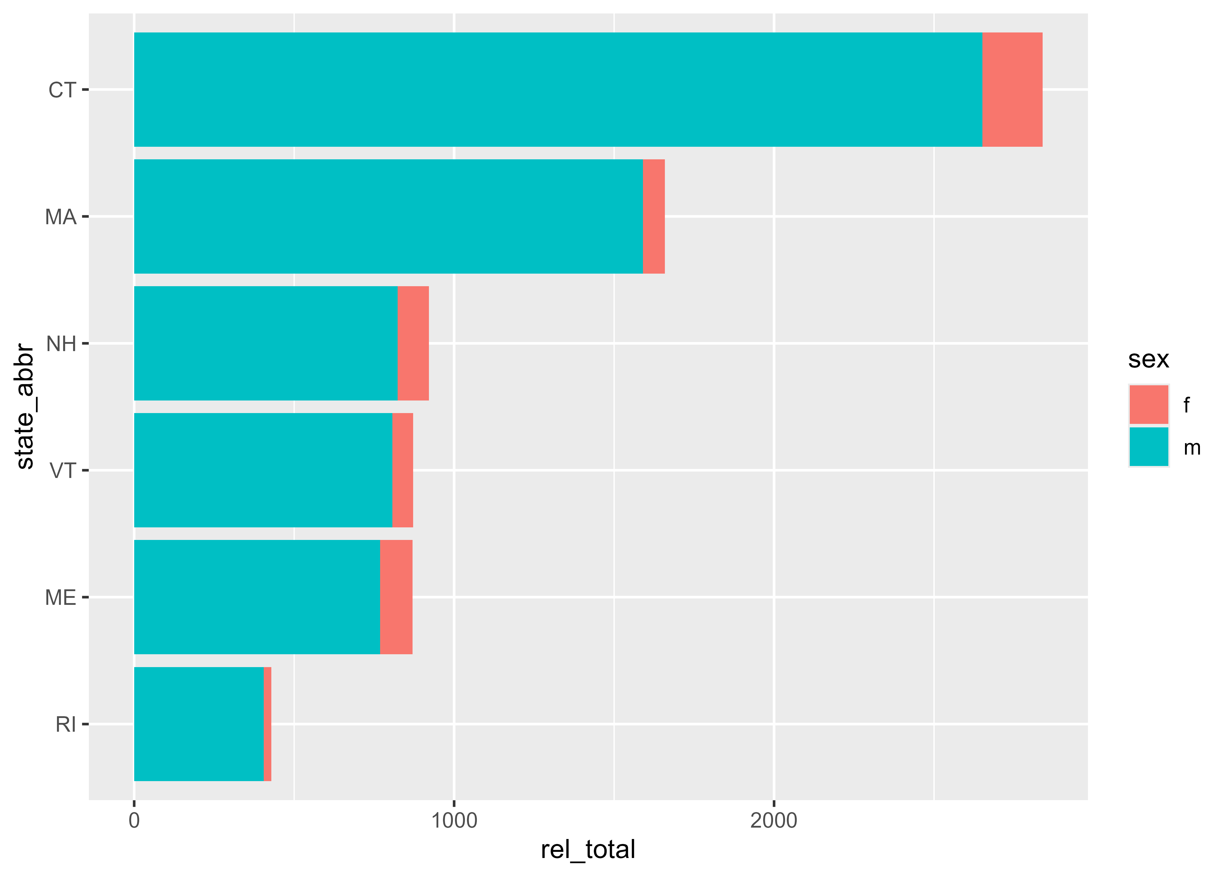
Color scales
Another way to improve this plot is by changing the fill colors. By default, ggplot2 uses the teal and red colors in the plot above, but they aren’t the most visually appealing. To change the fill colors, modify the plot using scale functions. To manually set the fill colors, add scale_fill_manual() and set the colors you want to use in the values argument of that function.
If you’re making a line graph, use scale_color_manual() to change the colors of the lines.
nps_release_new_eng_2022_sorted |>
  ggplot(aes(x = rel_total, y = state_abbr, fill = sex)) +
  geom_col() +
  scale_fill_manual(values = c("coral", "steelblue"))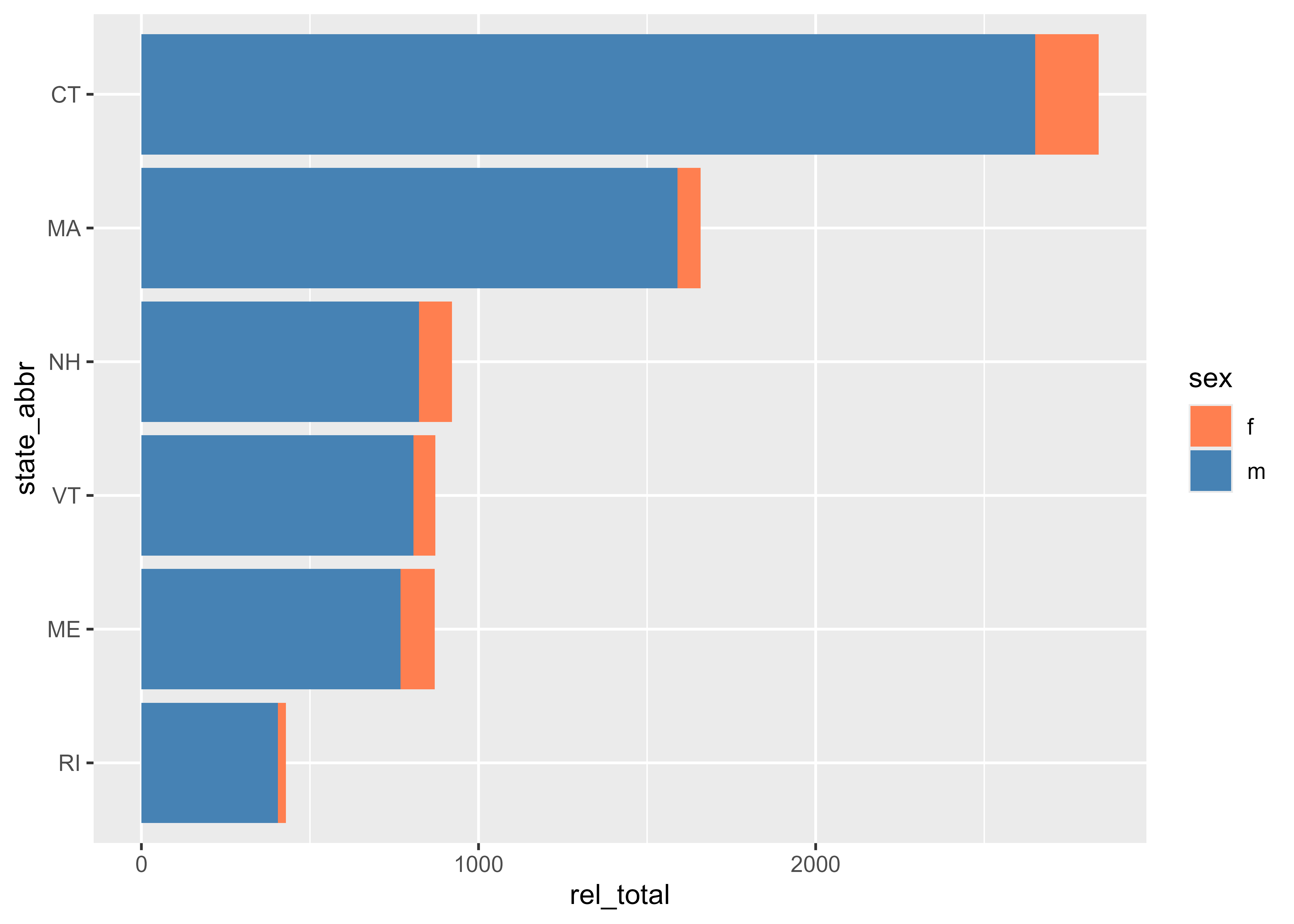
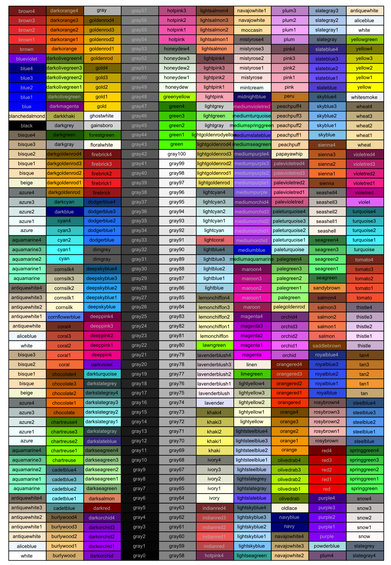
There are hundreds of “named” colors built into R that you refer to by name in R code as above with "coral" and "steelblue". The image below includes all the R named colors.
Alternately, you can use HEX codes to specify colors. Your agency may have preferred colors that you know the HEX code for, or you may just want more options than the named colors offer.
nps_release_new_eng_2022_sorted |>
  ggplot(aes(x = rel_total, y = state_abbr, fill = sex)) +
  geom_col() +
  scale_fill_manual(values = c("#669b6f", "#9d5393"))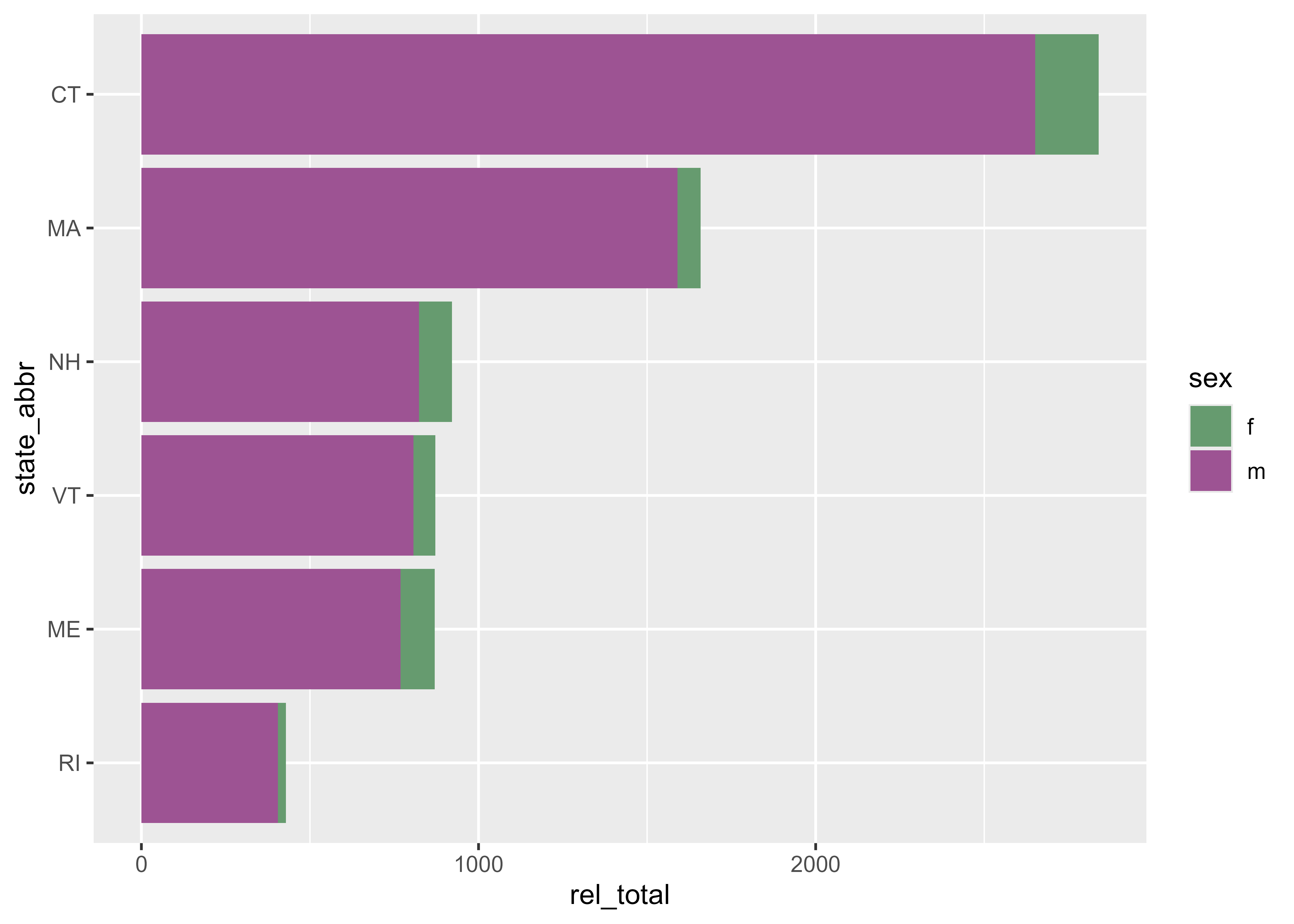
Labels
One of the simplest things you can do to improve the interpretability of your charts is to add labels. You can accomplish this by adding the labs() function to your ggplot2 code. Within labs(), specify the text you want to add to the title, subtitle, caption, legend, and x- and y-axes.
nps_release_new_eng_2022_sorted |>
  ggplot(aes(x = rel_total, y = state_abbr, fill = sex)) +
  geom_col() +
  scale_fill_manual(values = c("#669b6f", "#9d5393"), labels = c("Female", "Male")) +
  labs(
    title = "Prison Releases by Sex",
    subtitle = "New England States, 2022",
    caption = "BJS National Prisoner Statistics Program",
    fill = NULL,
    x = "Number of people released from state prison",
    y = NULL
  )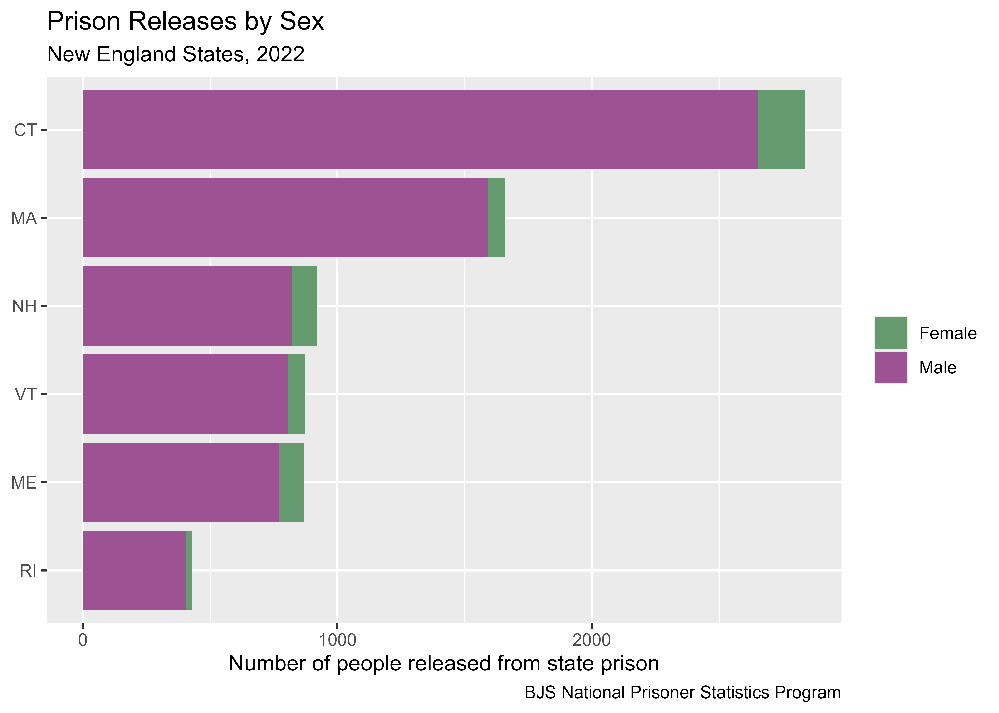
Note that the fill and y arguments are set to NULL. This removes the default label from the legend and y-axis. In this case, both the y-axis (state abbreviation) and legend (sex) are self-explanatory, and including a label does not necessarily improve the readability of the chart. Additionally, you can change the labels used in the legend by adding the labels argument to your scale function and specifying the values.
Themes
Other elements of ggplot2 can be customized using the theme. There are a number of built-in themes that you can add to your ggplot2 code to change the look and feel of your plot. theme_minimal() changes the background from gray to white and is a good place to start.
nps_release_new_eng_2022_sorted |>
  ggplot(aes(x = rel_total, y = state_abbr, fill = sex)) +
  geom_col() +
  scale_fill_manual(values = c("#669b6f", "#9d5393"), labels = c("Female", "Male")) +
  labs(
    title = "Prison Releases by Sex",
    subtitle = "New England States, 2022",
    caption = "BJS National Prisoner Statistics Program",
    fill = NULL,
    x = "Number of people released from state prison",
    y = NULL
  ) +
  theme_minimal()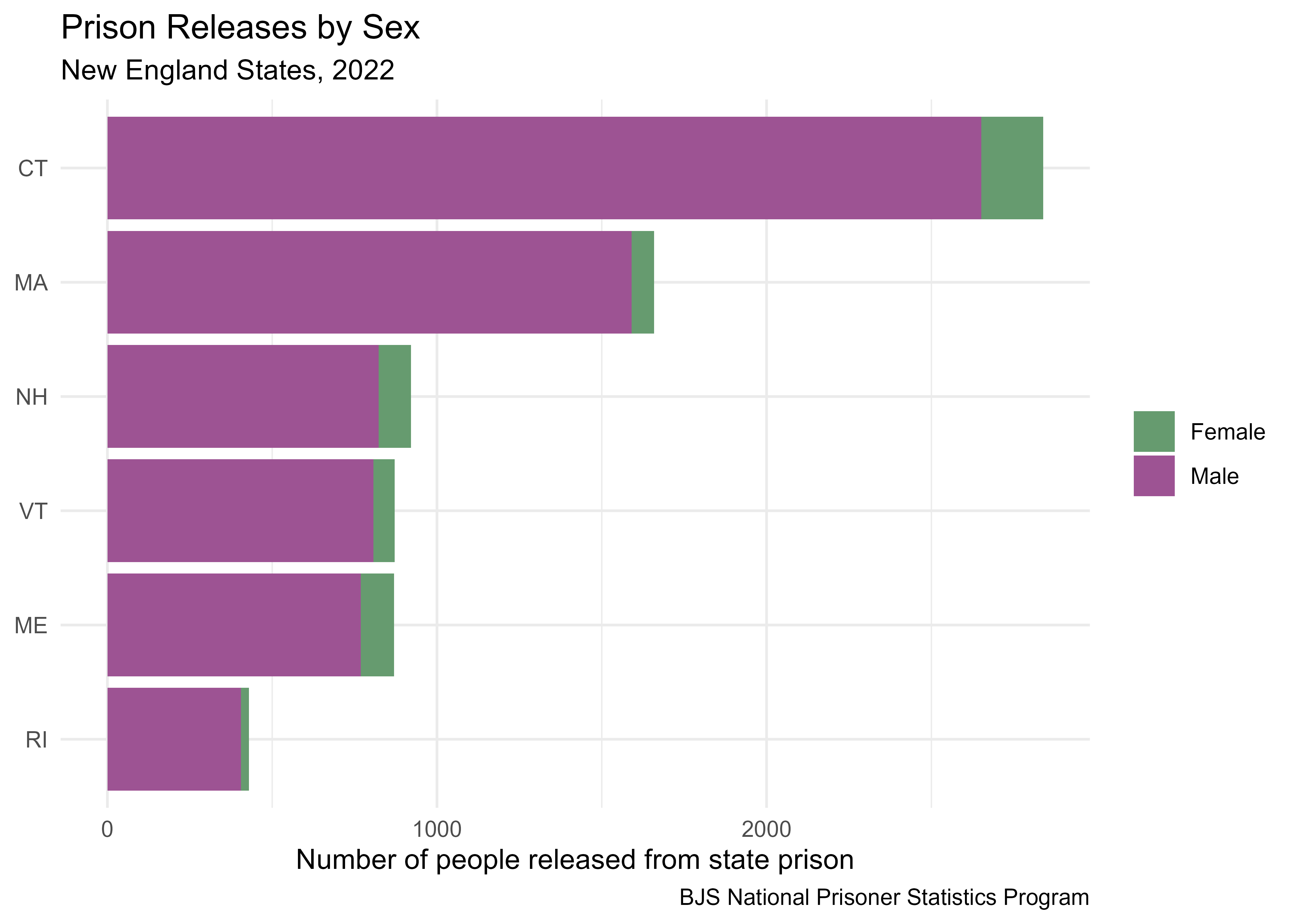
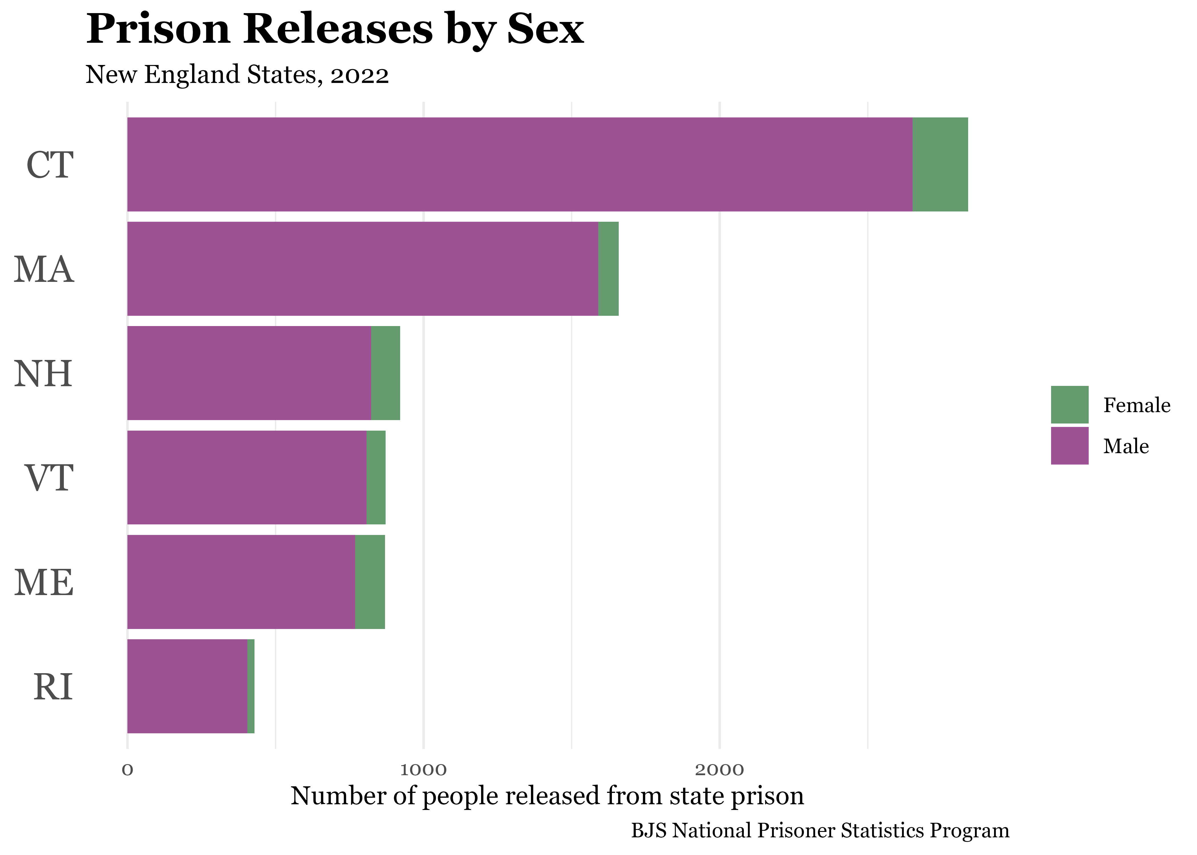
You can further customize the theme by changing the font using the base_family argument as well as modifying other elements of the theme within the theme() function. The following code changes the font to Georgia, increases the size of the title and y-axis text, and removes the grid lines from the y-axis.
There are more than 100 theme components you can change. The reference page for theme() lists them all.
nps_release_new_eng_2022_sorted |>
  ggplot(aes(x = rel_total, y = state_abbr, fill = sex)) +
  geom_col() +
  scale_fill_manual(values = c("#669b6f", "#9d5393"), labels = c("Female", "Male")) +
  labs(
    title = "Prison Releases by Sex",
    subtitle = "New England States, 2022",
    caption = "BJS National Prisoner Statistics Program",
    fill = NULL,
    x = "Number of people released from state prison",
    y = NULL
  ) +
  theme_minimal(base_family = "Georgia") +
  theme(
    plot.title = element_text(size = 18, face = "bold"),
    axis.text.y = element_text(size = 16),
    panel.grid.major.y = element_blank()
  )
Take some time to explore the different themes and customize components of your plots. Making plots for publication and communication can be greatly improved with some small tweaks. But be careful, as you may soon find yourself spending as much time making your plots beautiful as you do on the analysis itself!
Export plots
Now that you’ve created the perfect plot, you probably want to get it out of R and into a report, slide deck, or place that other people can see it. The ggsave() function is a quick way to save a ggplot; it takes the most recent plot and saves it to your working directory.
ggsave(filename = "prison_releases_2022.png")By default, it chooses the dimensions based on the current size of the plot pane in RStudio, so usually you’ll want to specify the width and height of the plot. For this particular plot, more appropriate dimensions might be six inches wide and four inches tall.
ggsave(filename = "prison_releases_2022.png", width = 6, height = 4)There are additional options you can set in ggsave() such as the resolution and file format of the saved file. Read more in the saving section of the ggplot2 book.
For instance, you can change the resolution of your saved plot by setting the dpi (dots per inch) argument. The default dpi for PNG plots is 300.
ggsave(filename = "prison_releases_2022.png", width = 6, height = 4, dpi = 600)You can also save a plot in a different format, such as SVG, by changing the file extension from .png to .svg.
ggsave(filename = "prison_releases_2022.svg", width = 6, height = 4)