library(tidyverse)
library(readxl)

nps_release <- read_excel("data/nps-releases.xlsx")Lesson 15: Data Visualization III
Introduction
This lesson builds on Lesson 11: Data Visualization II and demonstrates additional features of the ggplot2 plotting package that will improve and enhance your static plots. The three techniques that you’ll learn in this lesson relate to axis scales, color palettes, and faceted plots. You can make a good plot without using these elements, but as discussed in Lesson 11, making plots visually appealing and easy to interpret can take your good plot and make it great.
The examples you’ll work on in this lesson use the same nps_release data frame that you’ve worked with in previous lessons. Read in nps-releases.xlsx with the following code:
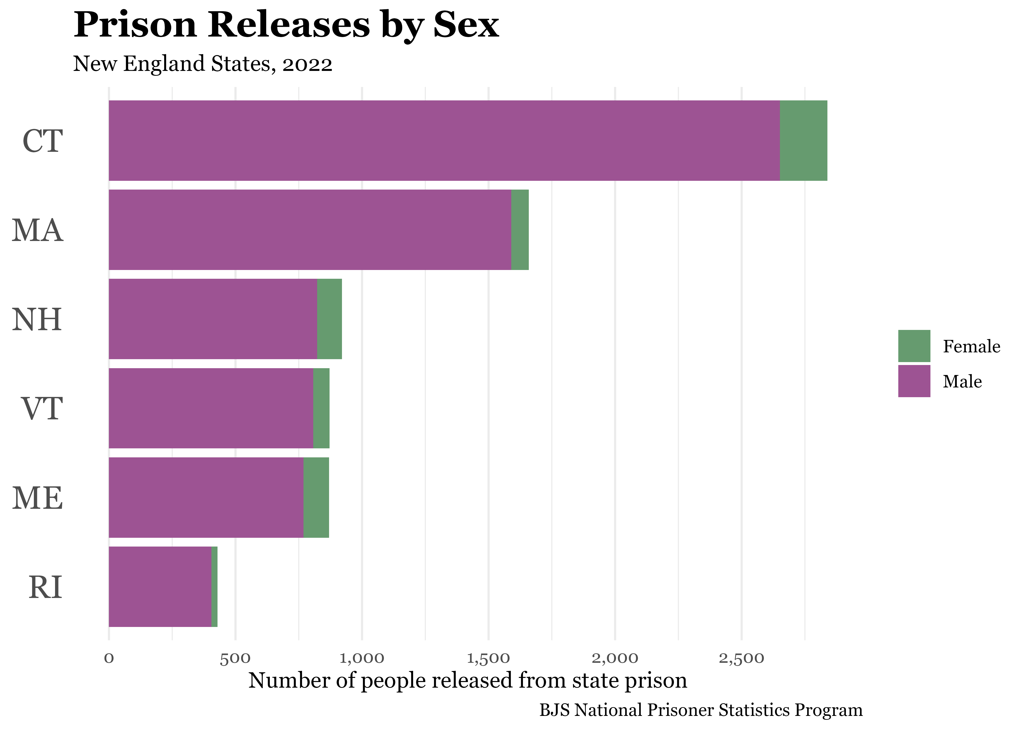
Next, re-create the final plot from Lesson 11, which shows the number of people released from prison in 2022 by sex for the 6 New England states.
nps_release_new_eng_2022 <- nps_release |>
  filter(year == 2022 & state_abbr %in% c("CT", "MA", "ME", "NH", "RI", "VT")) |>
  mutate(state_abbr = fct_reorder(state_abbr, rel_total))

nps_release_new_eng_2022 |>
  ggplot(aes(x = rel_total, y = state_abbr, fill = sex)) +
  geom_col() +
  scale_fill_manual(values = c("#669b6f", "#9d5393"), labels = c("Female", "Male")) +
  labs(
    title = "Prison Releases by Sex",
    subtitle = "New England States, 2022",
    caption = "BJS National Prisoner Statistics Program",
    fill = NULL,
    x = "Number of people released from state prison",
    y = NULL
  ) +
  theme_minimal(base_family = "Georgia") +
  theme(
    plot.title = element_text(size = 18, face = "bold"),
    axis.text.y = element_text(size = 16),
    panel.grid.major.y = element_blank()
  )
Axis scales
One way to improve this plot is by modifying the y-axis scale labels. By default, the axis scale labels are formatted as 1000 and 2000, without a comma separator. A simple change that improves readability is adding commas, making the axis labels 1,000 and 2,000. You can do this with the scale_ function that modifies the x-axis scale. There is also a helper package called scales that is useful for formatting scales and numbers that you should attach.
scales is installed when you install the tidyverse, so you likely already have it installed.
To change the format of the axis labels, add scale_x_continuous(labels = label_comma()) to your plotting code. label_comma() specifies that the labels on the x-axis should use a comma-separated format.
library(scales)

nps_release_new_eng_2022 |>
  ggplot(aes(x = rel_total, y = state_abbr, fill = sex)) +
  geom_col() +
  scale_x_continuous(labels = label_comma()) +
  scale_fill_manual(values = c("#669b6f", "#9d5393"), labels = c("Female", "Male")) +
  labs(
    title = "Prison Releases by Sex",
    subtitle = "New England States, 2022",
    caption = "BJS National Prisoner Statistics Program",
    fill = NULL,
    x = "Number of people released from state prison",
    y = NULL
  ) +
  theme_minimal(base_family = "Georgia") +
  theme(
    plot.title = element_text(size = 18, face = "bold"),
    axis.text.y = element_text(size = 16),
    panel.grid.major.y = element_blank()
  )
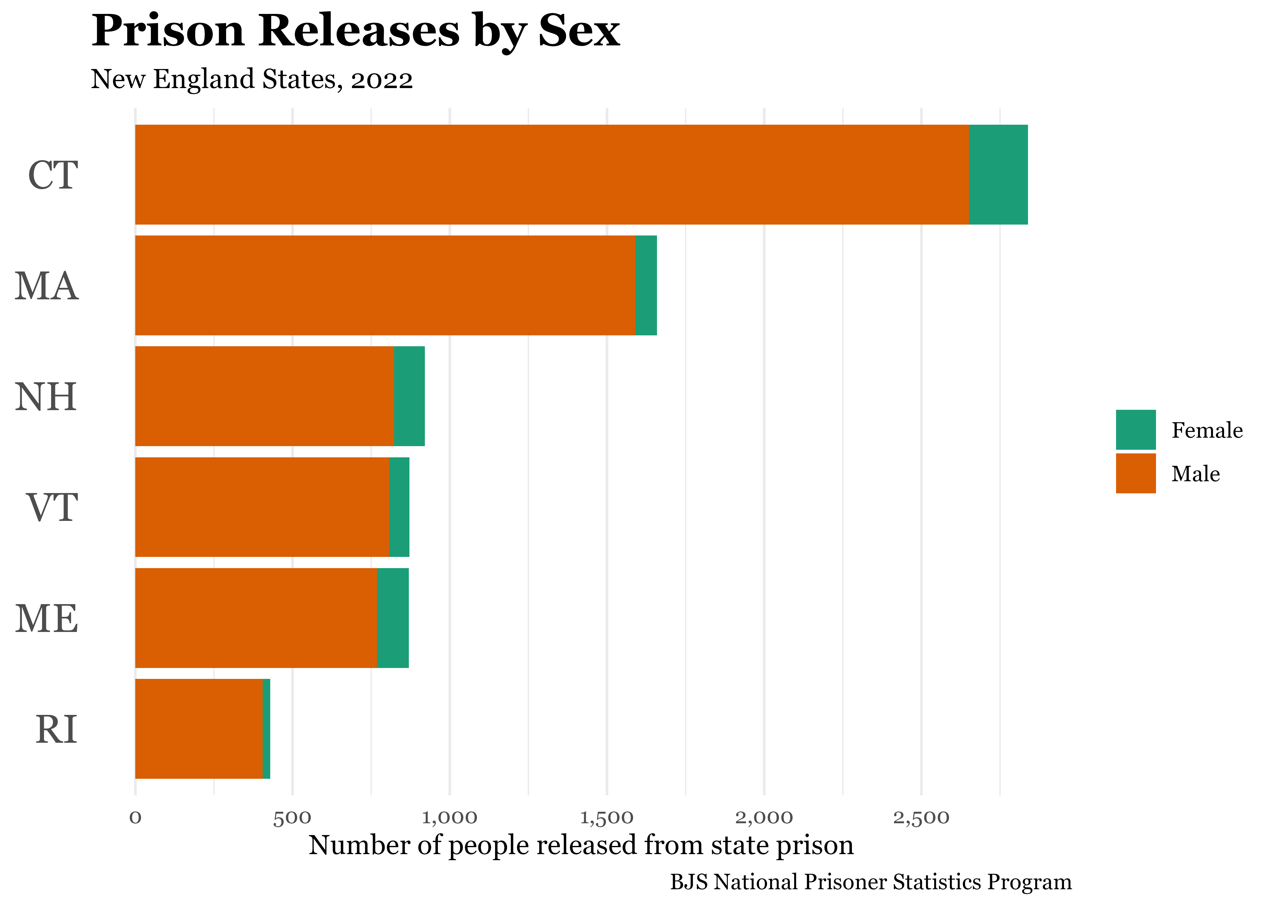
One other adjustment you can make to the axis scale is changing how often the labels appear. In the current plot, there are only two labels: 1,000 and 2,000. You may want to add labels at 500, 1,500, and 2,500 as well. To do this, again modify the x-axis scale property by manually setting the axis “breaks”. To add labels every 500, use seq(0, 2500, by = 500), which is a nice shortcut that creates a sequence of numbers from 0 to 2,500, by 500s.
nps_release_new_eng_2022 |>
  ggplot(aes(x = rel_total, y = state_abbr, fill = sex)) +
  geom_col() +
  scale_x_continuous(labels = label_comma(), breaks = seq(0, 2500, by = 500)) +
  scale_fill_manual(values = c("#669b6f", "#9d5393"), labels = c("Female", "Male")) +
  labs(
    title = "Prison Releases by Sex",
    subtitle = "New England States, 2022",
    caption = "BJS National Prisoner Statistics Program",
    fill = NULL,
    x = "Number of people released from state prison",
    y = NULL
  ) +
  theme_minimal(base_family = "Georgia") +
  theme(
    plot.title = element_text(size = 18, face = "bold"),
    axis.text.y = element_text(size = 16),
    panel.grid.major.y = element_blank()
  )
Notice that by changing the breaks, additional gridlines are also drawn at and between each break. You may or may not want the additional x-axis breaks and gridlines, but this is another aspect of the plot you have control over using the scale function.
Color palettes
In Lesson 11, you learned to manually set colors using scale_fill_manual(). If you don’t want to manually choose colors, you can use color palettes included with ggplot2. To use palettes from the ColorBrewer set of palettes, add scale_fill_brewer() (rather than scale_fill_manual()) to your ggplot2 code and specify the name of the palette you want to use. The ColorBrewer website allows you to browse and preview the color palettes, and you can find the name of the palettes on the website.

nps_release_new_eng_2022 |>
  ggplot(aes(x = rel_total, y = state_abbr, fill = sex)) +
  geom_col() +
  scale_x_continuous(labels = label_comma(), breaks = seq(0, 2500, by = 500)) +
  scale_fill_brewer(palette = "Dark2", labels = c("Female", "Male"))+
  labs(
    title = "Prison Releases by Sex",
    subtitle = "New England States, 2022",
    caption = "BJS National Prisoner Statistics Program",
    fill = NULL,
    x = "Number of people released from state prison",
    y = NULL
  ) +
  theme_minimal(base_family = "Georgia") +
  theme(
    plot.title = element_text(size = 18, face = "bold"),
    axis.text.y = element_text(size = 16),
    panel.grid.major.y = element_blank()
  )
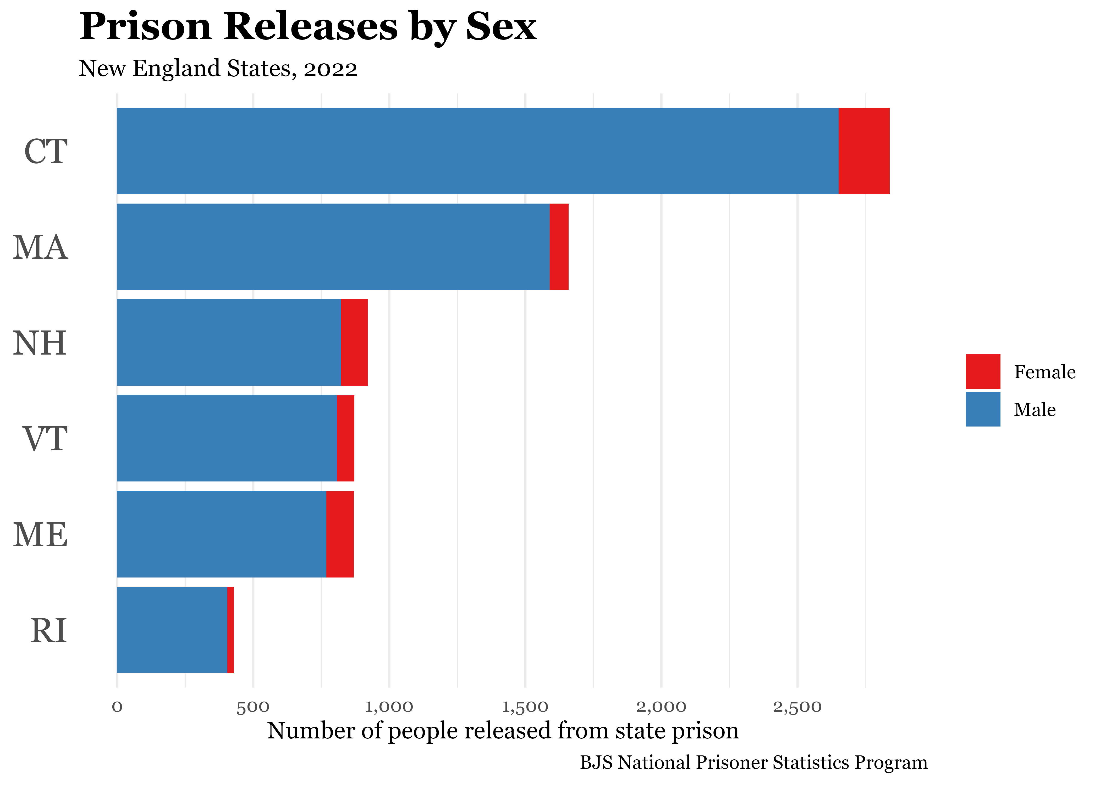
To try out a different ColorBrewer palette, change the palette argument value in scale_fill_brewer() to one of the other ColorBrewer palette names.
nps_release_new_eng_2022 |>
  ggplot(aes(x = rel_total, y = state_abbr, fill = sex)) +
  geom_col() +
  scale_x_continuous(labels = label_comma(), breaks = seq(0, 2500, by = 500)) +
  scale_fill_brewer(palette = "Set1", labels = c("Female", "Male"))+
  labs(
    title = "Prison Releases by Sex",
    subtitle = "New England States, 2022",
    caption = "BJS National Prisoner Statistics Program",
    fill = NULL,
    x = "Number of people released from state prison",
    y = NULL
  ) +
  theme_minimal(base_family = "Georgia") +
  theme(
    plot.title = element_text(size = 18, face = "bold"),
    axis.text.y = element_text(size = 16),
    panel.grid.major.y = element_blank()
  )
There are a huge number R packages you can install that contain additional color palettes. The topic of which colors and palettes to use is more complex than can be covered in this lesson. Chapter 11 of the ggplot2 book is a good resource for learning more about choosing appropriate colors for your plots.
Faceted plots
All of the plots you’ve made so far show a single year of data. But, what if you wanted to show a trend line? You could do this for a single state with a line plot like this:
nps_release |>
  filter(state_abbr == "VT") |>
  ggplot(aes(x = year, y = rel_total, color = sex)) +
geom_line() 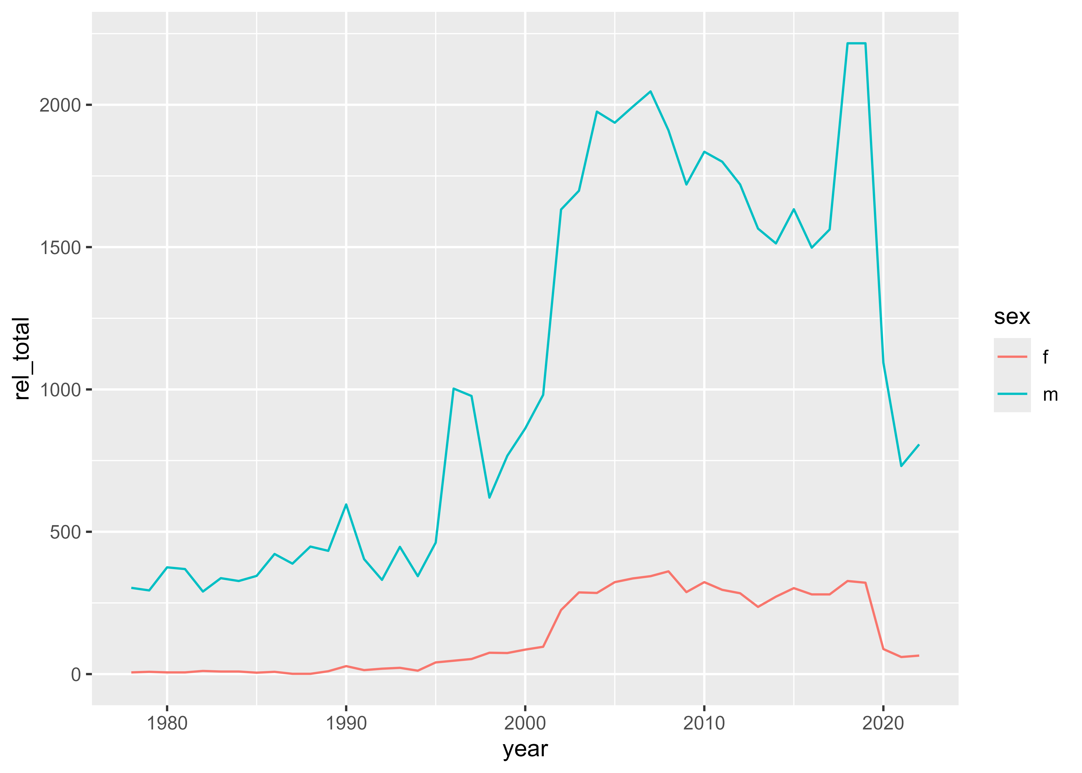
But if you try this with more than one state, you run into a problem.
nps_release |>
  filter(state_abbr %in% c("CT", "MA", "ME", "NH", "RI", "VT")) |>
  ggplot(aes(x = year, y = rel_total, color = sex)) +
geom_line() 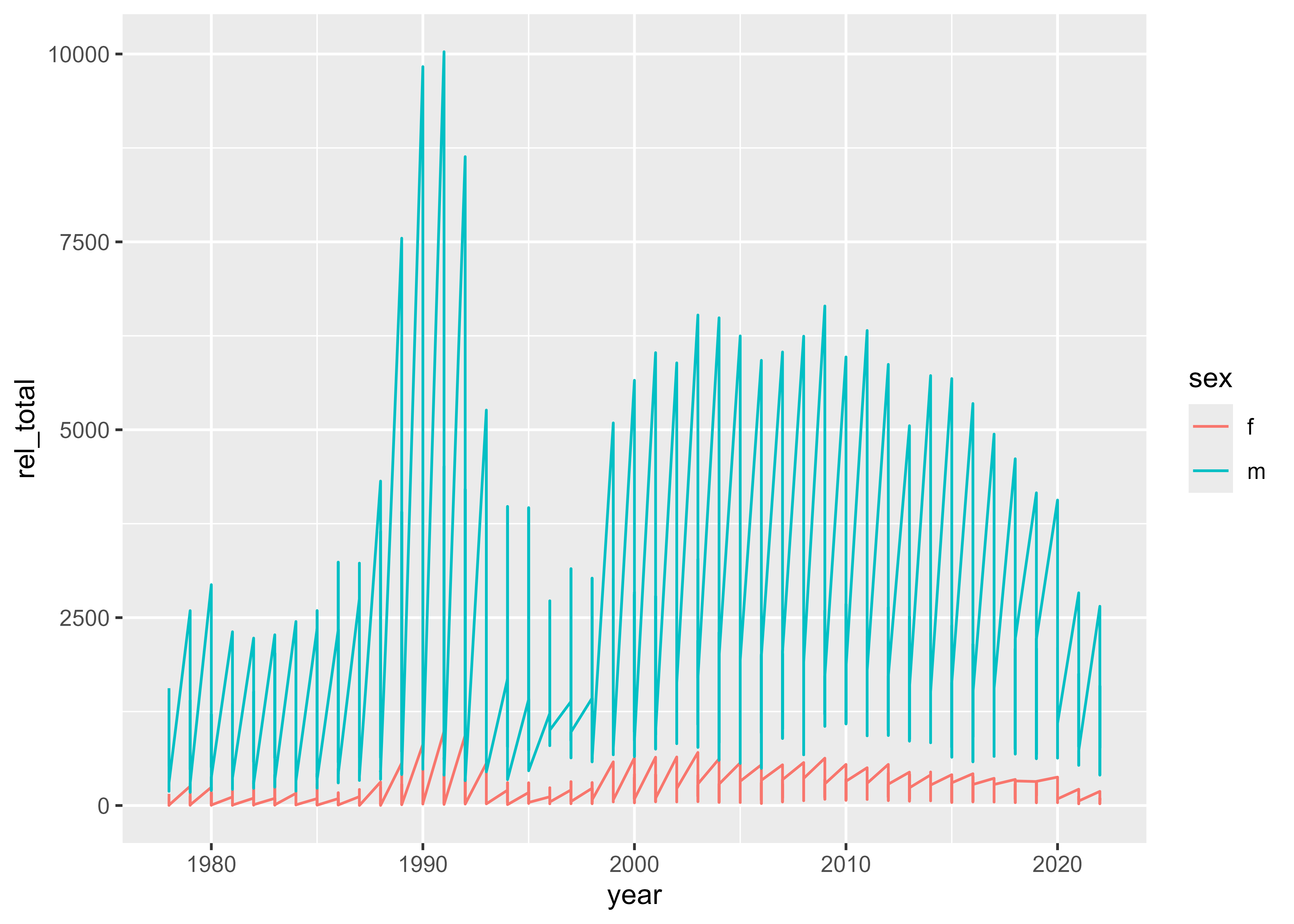
The code above is trying to plot more variables than it’s possible to display on a single chart: year, number of releases, state, and sex. With what you’ve learned so far, your options are to show a single state, a single year, or a single sex.
But, there is a feature of ggplot2 that allows you to show all these variables together: the faceted plot. Faceted plots are also known as small multiples and are essentially a grid of repeated plots that show a different aspect of the data. To make a faceted plot, use the same code as above and add one more line: facet_wrap(vars(state_name)).
nps_release |>
  filter(state_abbr %in% c("CT", "MA", "ME", "NH", "RI", "VT")) |>
  ggplot(aes(x = year, y = rel_total, color = sex)) +
  geom_line() +
  facet_wrap(vars(state_abbr))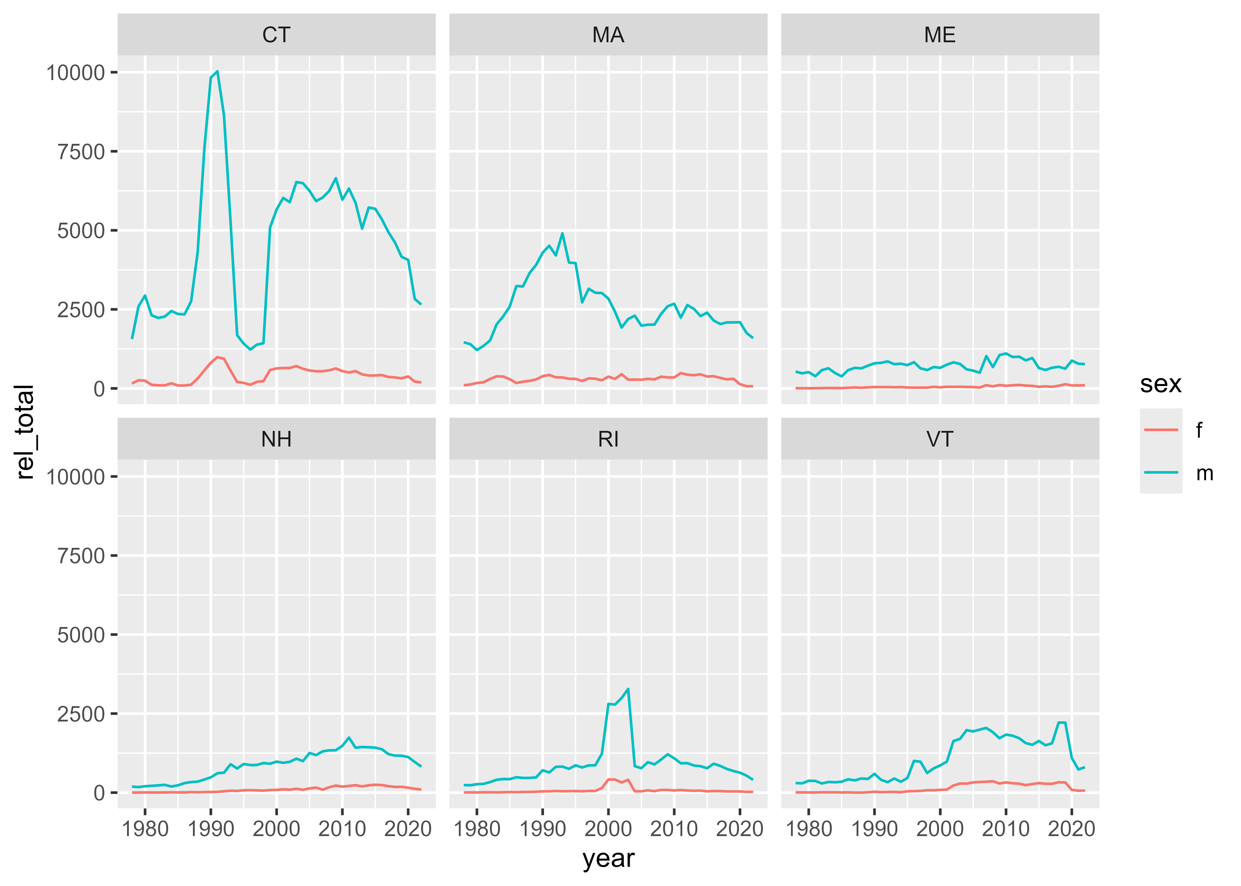
This creates six versions of the line plot—one for each state. One important thing to notice about this faceted plot is that each of the six state plots uses the same y-axis scale. Because there are so many more releases in Connecticut and Massachusetts, it can be hard to see the trends of a smaller state like Maine.
To correct for this, you can allow the y-axis scale to vary from plot to plot. This setting makes it so that the y-axis scale is set appropriately for each state, rather than the plot as a whole.
nps_release |>
  filter(state_abbr %in% c("CT", "MA", "ME", "NH", "RI", "VT")) |>
  ggplot(aes(x = year, y = rel_total, color = sex)) +
  geom_line() +
  facet_wrap(vars(state_abbr), scales = "free_y")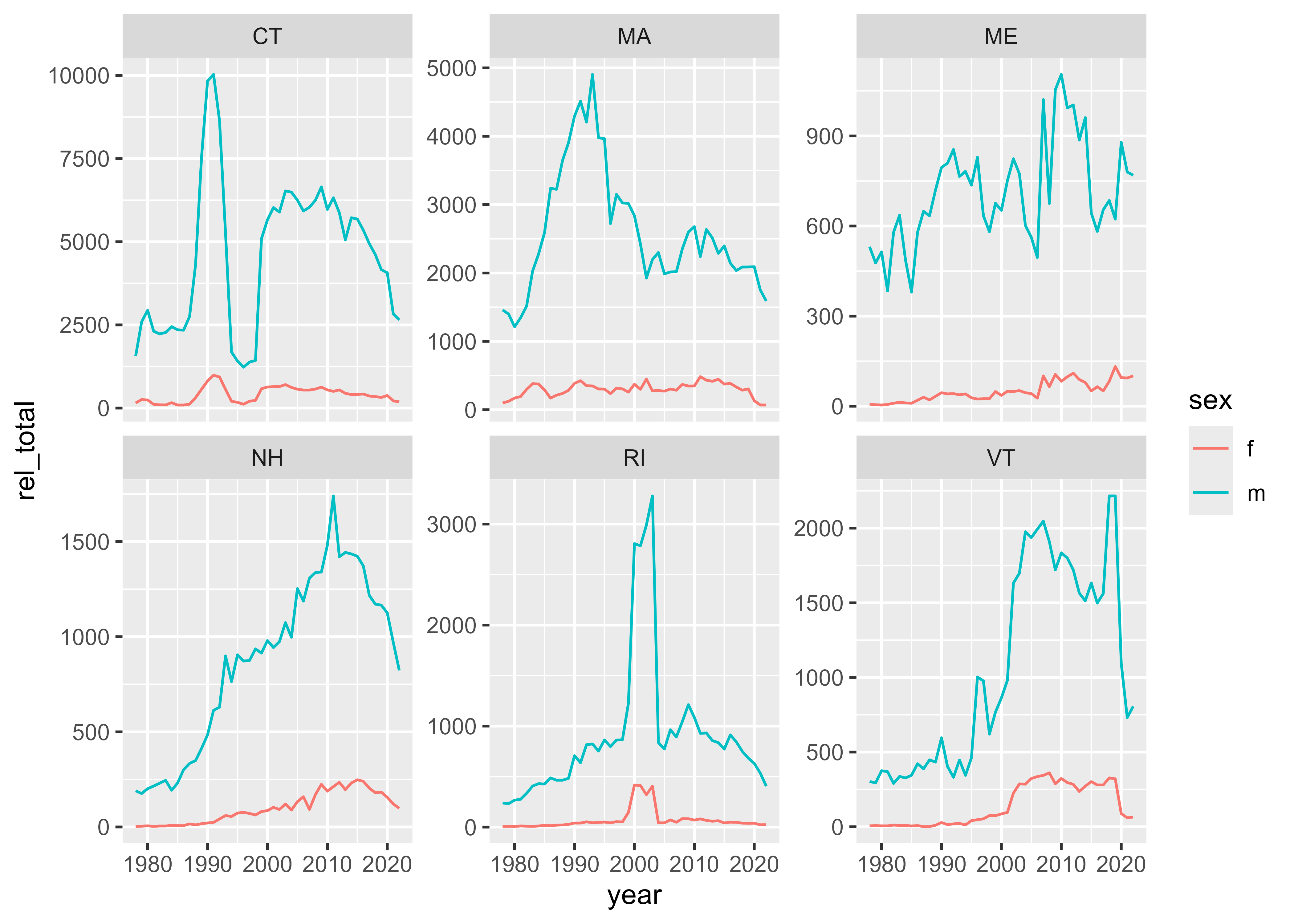
With this change, it is now easier to see the trends within each state, but the downside is that it’s harder to compare between states. Readers will have to notice that the y-axis scale for Connecticut is different from the scale for Maine, otherwise they might think that there were a similar number of releases in Connecticut and Maine. Depending on the context and meaning you’re trying to communicate, it may or may not be appropriate to use free axis scales in a faceted plot.
As with any other ggplot, you can also change the colors, font, theme, and more of a faceted plot.
nps_release |>
  filter(state_abbr %in% c("CT", "MA", "ME", "NH", "RI", "VT")) |>
  ggplot(aes(x = year, y = rel_total, color = sex)) +
  geom_line() +
  facet_wrap(vars(state_abbr), scales = "free_y") +
  scale_x_continuous(breaks = c(1980, 2000, 2020)) +
  scale_y_continuous(labels = label_comma()) +
  scale_color_brewer(
    palette = "Set1",
    labels = c("Female", "Male"),
    guide = guide_legend(reverse = TRUE)
    ) +
  labs(
    title = "Prison Releases by Sex",
    subtitle = "New England States",
    caption = "BJS National Prisoner Statistics Program",
    color = NULL,
    x = NULL,
    y = "Number of people released from state prison"
  ) +
  theme_minimal(base_family = "Georgia") +
  theme(
    plot.title = element_text(size = 18, face = "bold"),
    strip.text = element_text(size = 12, face = "bold"),
    axis.text = element_text(size = 8),
    panel.grid.minor = element_blank()
  )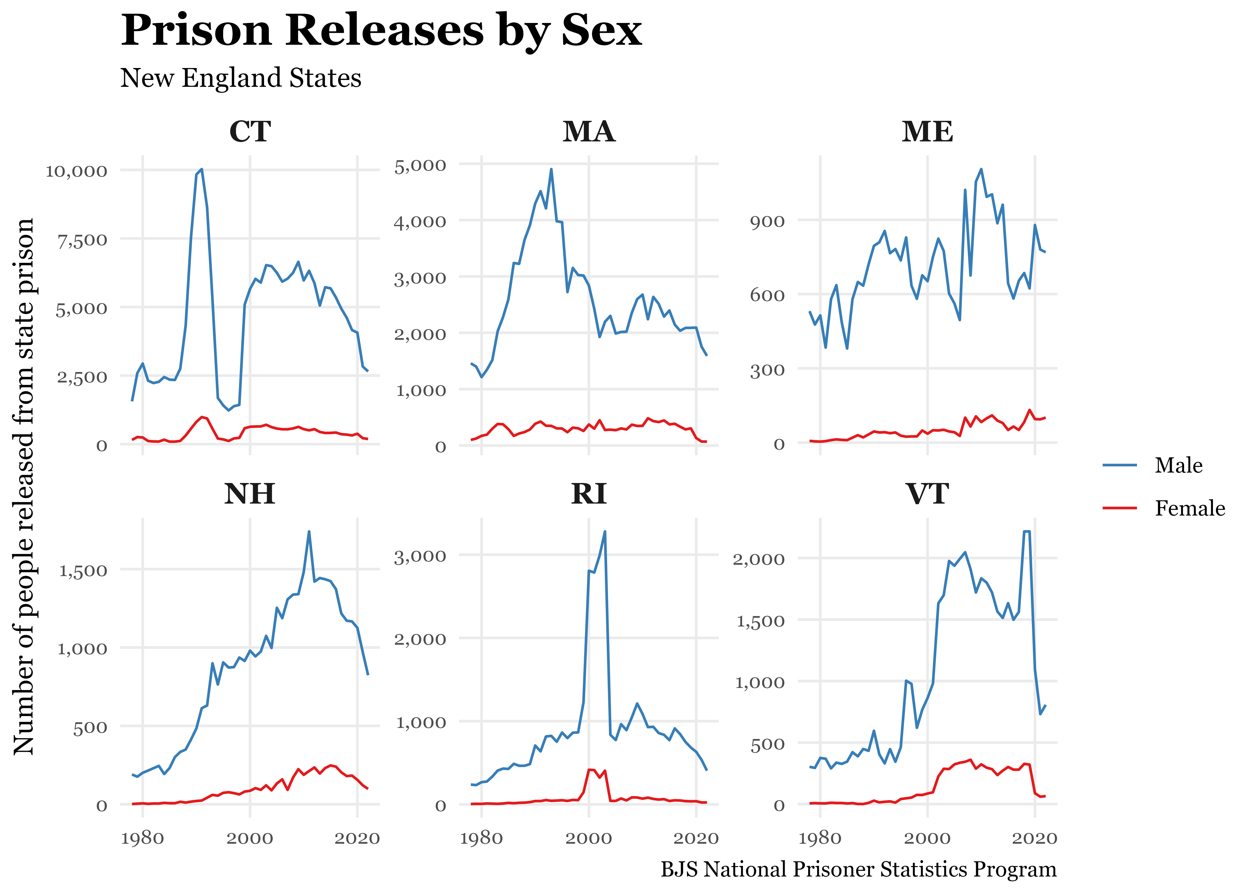
Ultimately, the design and layout of the plots that you make are in service of the information or message you’re trying to communicate. If the techniques discussed in this lesson will help you communicate with people using your plots, you should try them!
Resources
- R for Data Science (2e), Chapter 11 Communication: https://r4ds.hadley.nz/communication
- ggplot2: Elegant Graphics for Data Analysis (3e), Chapter 11 Colour scales and legend: https://ggplot2-book.org/scales-colour
- R for Data Science (2e), Chapter 9.4 Facets: https://r4ds.hadley.nz/layers.html#facets